

The Sharks rebrand landed on 6 August 2026, and it goes well beyond a crest. The Durban union is now officially known as Sharks Rugby Club, backed by a stated business philosophy, a returning apparel partner, and a retail and digital overhaul — the most significant identity change in the club’s professional history, described by the club as 150 years in the making.
This is not a logo swap. It’s a name change, a commercial strategy, and a leadership statement, all delivered under one banner.
Thirty of those 150 years belong to the Sharks name itself. In 1996, Natal Rugby Union rebranded from the “Banana Boys” to the Sharks, a move now framed as the same innovative spirit driving this latest change.
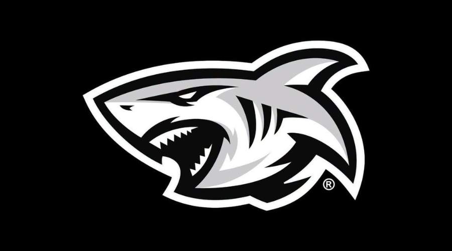
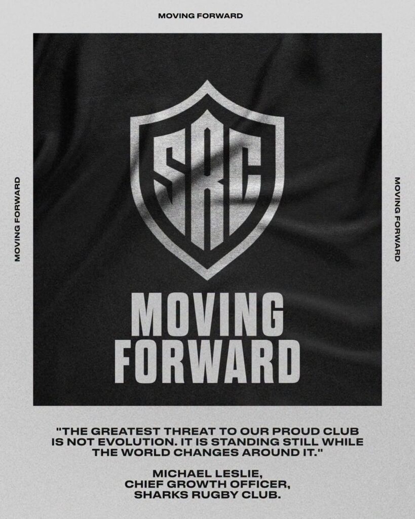
Two new visual elements anchor the rebrand. The SRC logo becomes the club’s corporate identity, sitting on the chest of the playing jersey. A new, more ferocious Sharks icon replaces the long-loved anthropomorphic “Sharkie” mascot as the primary match logo, used across promotions, advertising, and other key brand assets. Both retain the black and white colour scheme that has carried the club since 1996.
The launch leans hard on one tagline: BLACK WHITE FOREVER.
Owner Marco Masotti, in an open letter to supporters:
“There is a seat in the South East Stand at Hollywoodbets Kings Park that I will never forget. It was where I sat with my father, Venio Masotti.”
Owner Marco Masotti:
“Our badge is evolving. Our DNA is not.”
Masotti is explicit that the rebrand isn’t about wanting a new crest for its own sake. He frames the project around sustainability — building a club strong enough that, three decades from now, another young supporter can fall for it the way he did in that stand.
Shaun Bryans, Chief Executive Officer of Sharks Rugby Club:
“Innovation has always been part of who we are. This evolution is not a departure from that tradition; it is its continuation.”
Shaun Bryans, Chief Executive Officer of Sharks Rugby Club:
“Our badge has evolved. Our core never will.”
The business strategy behind the rebrand is being stated outright, not left implied.
Michael Leslie, Chief Growth Officer of Sharks Rugby Club:
“The strongest clubs in world sport are also the strongest brands. Sustained investment in elite performance requires sustained commercial growth.”
Michael Leslie, Chief Growth Officer of Sharks Rugby Club:
“The greatest threat to a proud club is not evolution. It is standing still while the world changes around it.”
“Call it what it is — this isn’t a badge tweak, it’s the Sharks staking a claim as one of the sharpest brands in world rugby!” – 🎙️Jay
Coaching continuity sits inside the same messaging. JP Pietersen now leads the coaching structures, presented by the club as a Sharks man who understands exactly what the badge represents.
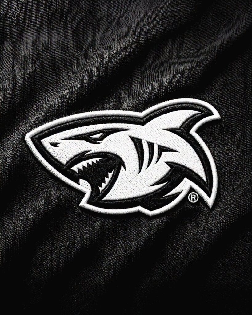
The commercial rollout underlines how far this extends beyond the crest. Reebok returned as technical apparel partner in mid-July 2026, bringing an expanded range spanning performance wear, lifestyle, retro, golf, Classics, and footwear. New Currie Cup and URC kits follow in the coming weeks, alongside a fully reimagined Shark Cage retail store, a new club website and e-commerce platform, and what the union calls broader brand experiences across the Sharks ecosystem. The full project has been years in the making.
Fan reaction has split. Plenty have backed the sharper, fiercer new icon as a natural evolution. Others miss Sharkie specifically, with some calling the new mark more generic than what it replaces.
Masotti’s letter anticipates that tension directly, acknowledging the badge lives in family photographs and treasured jerseys across generations. His ask to supporters is to judge the change by what the club produces on the field, not by the crest alone.
The values the club insists haven’t moved: the hunger, the resilience, the courage, and the pride of representing KwaZulu-Natal, carried in the Black and the White.
Owner Marco Masotti:
“This evolution does not replace our history. It ensures our history has a future.”
The Sharks rebrand is a statement of intent — commercial, cultural, and competitive — built on 150 years of history and aimed squarely at the next 30.
📸 Images via The Sharks
Header: SHARKS RUGBY REBRAND
Subhead: BLACK AND WHITE, FOREVER